Rio Tinto Regional Center Office
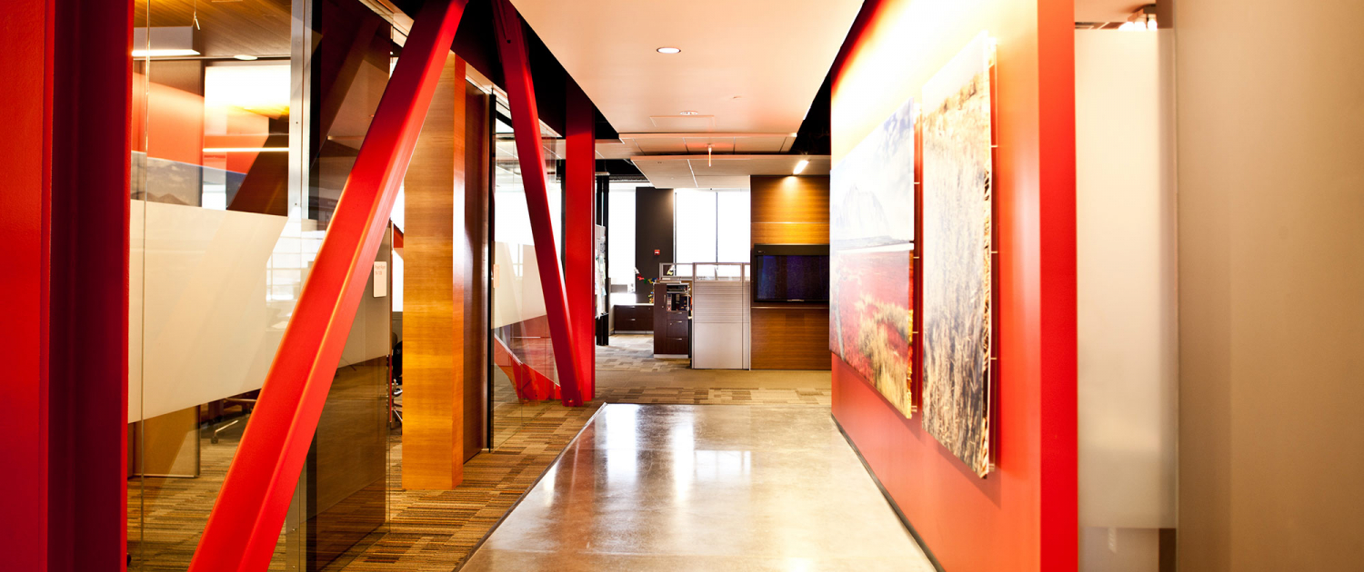
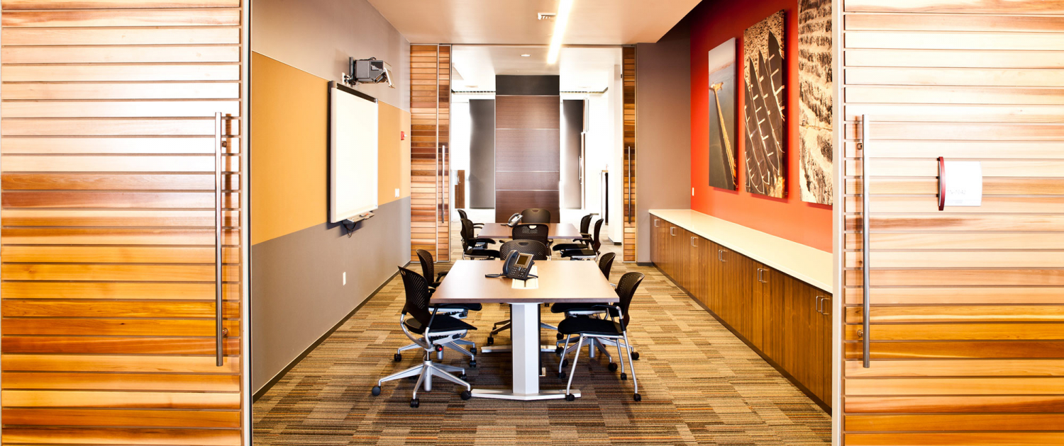
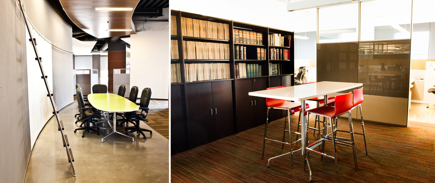
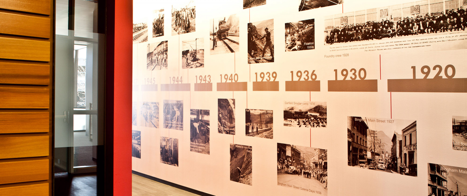
Rio Tinto’s open office design created a beautiful space, but a space with lacking workplace pride, devoid of brand identity, and trapped in stale paradigms. MHTN led the management group and executives through a process to respect the spirit of the original design while addressing clear objectives to create a modern, efficient, and high-quality open work environment. On the forefront of transformative workplace ideas, the result incorporated diverse accommodations for meeting space and casual work environments. Upholstered nooks provide privacy for small meetings or phone conversations. A glass cube conference room is cradled in red steel bracing. Rio Tinto’s signature red is combined with cedar and raw steel, becoming a unifying element throughout.
SERVICES: Interior Architecture, Interior Design
Design Challenge
BRANDING AESTHETIC
The design continues the international corporation’s brand aesthetic, creating an environment that is flexible and custom suited to their workplace culture.
Information
BY THE NUMBERS
South Jordan, UT | 120,000 SF remodel + 22,000 SF T.I. | 2012
Earth Centered
Low impact materials and maximization of flexible, demountable office wall systems.


